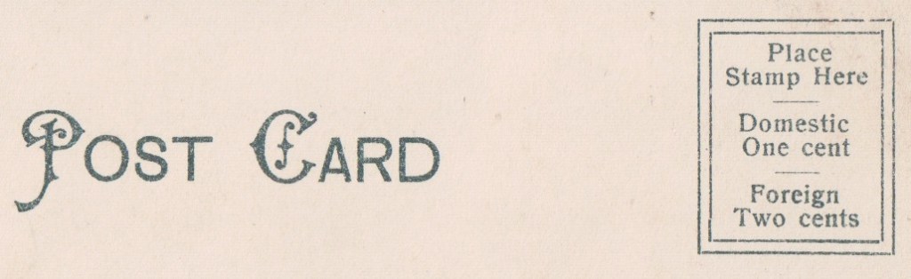
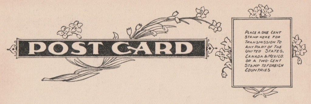
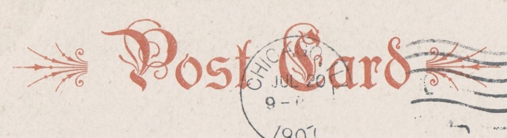
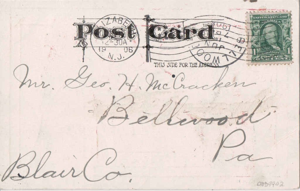
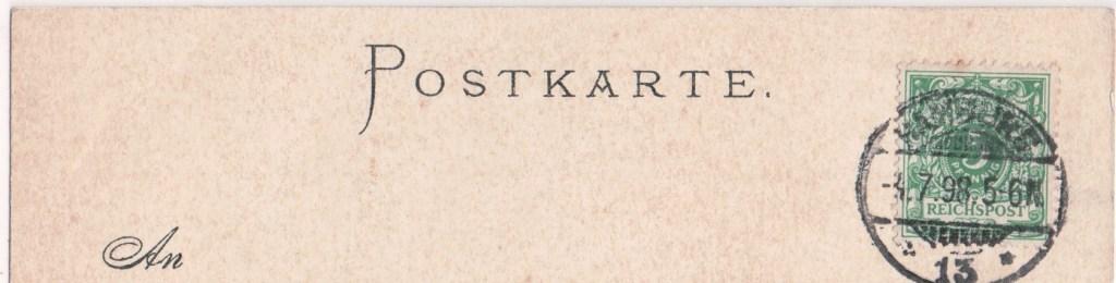
Here are some distinctive styles of “POST CARD”. Otherwise, try my Publishers’ Initials Logos and Series page.
American News Company
Carlo Bassani

Blum & Degen

Bosselman

Federal Engraving & Publishing Company
Louis Glaser

Golike & Wilburg

Alfred Holzmann
Knackstedt & Näther
K&N produced cards for a number of Scandinavian publishers in a distinctive font and wording.
Source: Famgus Vykort
Langsdorf

H C Leighton

Lichtenstern & Hariri

Modiano

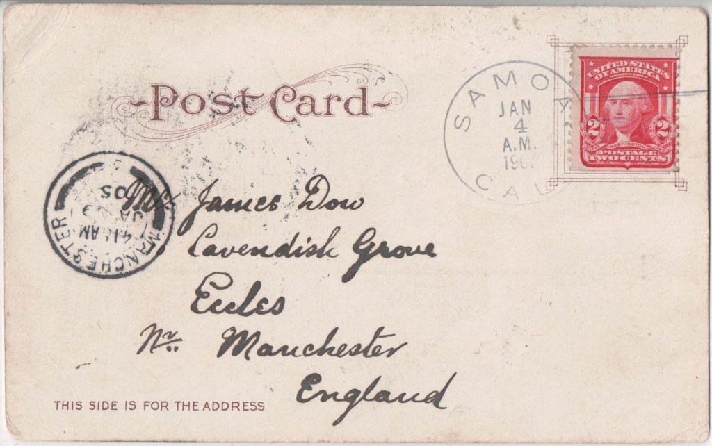
The elaborate A in the first line of the address is perhaps more memorable than the postcard heading.
PB, Harlesden, London N.W.

Ritter & Kloeden
Rotary Photographic Company Ltd

The Rotograph Company, New York

Adolf Selige

Societa Editrice

Trenkler

Some of the cards issued by Ludwig Klement of Frankfurt (qv) also had this style, suggesting that Trenkler produced them.
Valentine & Sons

Wyndham & Company

Lawrence of Dublin used the same design albeit sometimes in green.
unknown American

possibly Blanchard Press
