Ichida Offset Insatsu Goshi Kaisha,
Kobe, Japan

diamond shape with a stylised “I” in the centre in a dotted-line stamp box
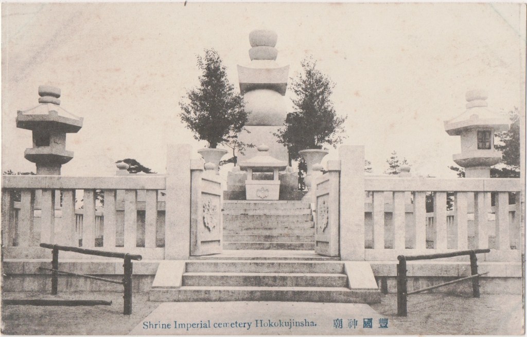
The Ichida Offset Printing Company was founded in 1870, at Kobe, by Koshiro Ichidi. In 1912 the business was converted into a gomeikaisha or five person company. In 1914 the concern was moved to Osaka and Tokyo and Kobe branch offices were established. In 1915 it became a limited partnership and a new factory was erected.
By 1917, Ichidi and Fukusaburo Kaibara were the active partners, carrying on offset, photographic, lithographic, and other general printing business, and the manufacture of paperware. The company also designed catalogues, and labels along with printing, and book-binding. The company was situated near the central railway station in Osaka in premises covering an area of 500 tsubo. The tsubo is a traditional Japanese unit of area measurement, equal to 1 ken square, about 3.3 square meters or 35.5 square feet. It is still the official base unit of area in Taiwan. The building was planned on the model of the most up-to-date and complete printing offices in Europe. There were over fifty rotary litho presses, plate printing presses, and letter-press printing machines. Every day over 200,000 large sheets were printed.
Ichida Company (Ichida insatsusho gaisha) were the printers for the Nippon Yusen Kaisha (NYK) steamship postcards which were colour lithographs; ink and metallic pigment with collotype inserts.
Not to be confused with: Soto Ichida (died 1896) studio photographer, Kobe; The silver prints of studio photographs of a baby online do not suggest that the photographer also produced topographical postcards.
Sources: Museum of Fine Arts, Boston; Japan in the Taisho era. In commemoration of the Enthronement Iwata Nishizawa 1917 Internet Archive.

Ignorant Club, Italy
- A E Fiecchi Edit – Venezia Club Ignoranti – Venezia – Beneficenza di Natale 1901

The Ignorant Club was started in Padua on 2 September 1889 by a group of bontemponi (lively companions) who would spend the evening in an old restaurant in Padua, play a game of cards and enjoy a good glass of Friularo wine. Friularo is the local name for the Raboso grape variety in the southern half of the Padua province. A misspelling of the Latin for charity that night led to the name of the organisation.
The following year, a branch was born in Udine and by December 1890, Verona and Venice had branches. They spread through Italy in the next years.
The club was launched on 8 February 1891 by a First Carnival billed as the awakening of ignorance. In 1892 the first Statute of the Club was drawn up. Although this focusses on charitable purposes the commercial and cultural aspect was not neglected. In 1895 the Sodality announced a Provincial Sample Exhibition with an exhibition of floriculture, inviting hundreds of manufacturers from all over Italy. The success was so great that the Ignoranti Club was decorated with a great gold medal by King Umberto I. A shield with the effigies of a goose and a pumpkin was chosen as a social emblem to signify the perfect ignorance of the Sodality. In 1904, it commissioned its own hymn and, in 1905, the Club took on the burden of building workers’ houses. In 1913 it was a founding member of the Croce Verde a voluntary association that offers Paduans transport and assistance service of the injured and sick and the donation of blood. Club Ignoranti, now the oldest charitable association in the city of Padua, continues to meet once a month.
This card was produced by Fiecchi of Venice as part of the club’s Christmas charity effort in 1901
Sources: clubignoranti.it difesapopolo.it

Illustrated Post Card Company, Montreal, Canada
- Illustrated Post Card Co., Montreal

The Illustrated Post Card Company, Temple Building, 185 St James Street, Montreal. An important Quebec publisher of Canadian views as black & white and tinted collotypes. They had cards made in Germany by Emil Pinkau & Co. They were agents for Canada for the British companies Rapid Photo Printing and Cameo (Bas-Relief) Post Cards. Their Spring 1906 collection included beautiful cards in seven colors obtainable at reasonable prices. Embossed cards, new photo-gloss post cards and many other varieties. Cards appropriate for correspondence around moving time, May 1, occupy a place on the shelves too. Moving Day was a tradition in New York City dating back to colonial times and lasting until after World War II. On February 1, sometimes known as “Rent Day”, landlords would give notice to their tenants what the new rent would be after the end of the quarter, the tenants would spend good-weather days in the early spring searching for new houses and the best deals and on 1 May all leases in the city expired simultaneously at 9:00 am, causing thousands of people to change their residences all at the same time2. The photo-gloss cards were particularly beautiful finish of enamel post cards, topographicals finished in the highest possible manner, the enamel glistening like a mirror. At this time, they had:
… a new line and a special offer, something in the stationery line which should attract attention, and, which should be a means of profit to the wide-awake merchant. This is the “Aurora” jeweling outfit. It is used for ornamenting picture post cards, Christmas and show cards, fire screens, photo frames, and a variety of other purposes in this line. The outfit consists of a bottle of special adhesive, a special glass pen, a brush, and ten bottles of special powders, all the colors necessary to artistically trace designs on post cards, etc. The outfit is compactly and neatly packed in a good box, with directions as to use. This is something of a novelty, and as it is so easy to use it should be a good line for the merchant to carry with his stock of illustrated Fancy lines in post cards are going well, and the comic cards are very much in demand also. Available at the special price of $1.75
Sources: wikipedia Moving Day; BOOKSELLER AND STATIONER January 1906

At that time the company substantially increased their warehouse accommodation in the Temple Building to provide for increased necessities of the business. They now have a bright suite of rooms allowing for the better handling of stock and more prompt delivery of orders. Their manager, Joseph Avon, spent time purchasing novelties in Europe.
Illustrated Post Card Company,
New York
- Illustrated Postal Card Co. New-York-Germany, eagle logo and IPC&N Co monogram
- Illustrated Postal Card Co. New-York-Leizig, eagle logo and IPC&N Co monogram
- Ill Post Card Co., NY, eagle logo and IPC&N Co monogram
- ILLUST. POST. CARD CO., NY, eagle logo
- ILL. POST CARD CO., NY, eagle logo
- ILL. P. CARD CO., 118 CHAMBERS ST., NY, eagle logo
- ILLUSTRATED POST CARD CO., 118 CHAMBERS ST., NEW YORK, eagle logo
- eagle logo and IPC within C monogram

Illustrated Post Card Company, New York, 118 Chambers St, New York printed millions of cards at the time when picture postcards were at the peak of their popularity. This major publisher produced a wide variety of tinted halftone postcards in series that were printed by Emil Pinkau in Leipzig, Saxony. Each city or location of their colour card sets was assigned its own number prefix. They also published an unnumbered series of chromolithographic fine art cards that were printed in Dresden. Their best known cards are from a very large set that captured scenes throughout the City of New York. These cards tended to use brighter than average colours and were titled in a very distinct font. Mark Ovenden uses one showing a cutaway of the BMT Subway and Brooklyn Bridge to illustrate his underground cities book.
Similar cards, but with more subdued writing, appeared afterwards depicting scenes from the surrounding regions such as Long Island. In 1909 they stopped importing cards from Germany and began printing their own. A large number of black & white cards were produced in a more open halftone with some being poorly hand coloured. These black & white cards were numbered consecutively.
Many of their early cards do not have their name on them, only their distinctive eagle logo of a bird in flight above a shield of the stars and stripes. It is difficult to know how many such images were added by others to their own cards.
Source: metropostcard archive

Georges Imbert, Paris
- G.I. Paris

Georges Imbert, photographer and publisher, 37 Sevastopol Boulevard, Paris4. Imbert published photocards of the people and places of Paris as well as posed studio moralities, moving into colour in the divided-back era.
Source: cparama.com/forum

David M Imlay, Spokane, WA, USA
See article on Panoramic cards in Unusual Cards
C. Imperiale, Naples
- G. BLÜMLEIN & CO., FRANKFURT S M., RAPP*. C. IMPERIALE – NAPLES
C. Imperiale of Naples appears to have been the agent of G. Blümlein & Co of Naples. Between at least 1901 and 1942 C. Imperiale of Sant’Angelo, Rome published historical text books including Genoese Annals of Caffaro and his followers in five volumes. It is not clear if the two are related.
*Rappresentanza – agency
Imperial Hotel
Russell Square, London
- THE IMPERIAL HOTEL, Russell Square, LONDON

In 1815 Henry Walduck was granted a license to open a Catering Establishment in Gravesend, which soon flourished. His son Thomas Henry Walduck moved to London in the early 1830’s. He purchased a hotel in Warwick Court which was sold in 1863 by his son, Thomas Henry Walduck Jnr, who moved to Bloomsbury and purchased the lease of the old Bedford Hotel for £290 at an annual rent of £90. At the time, this was the only hotel permitted on the Duke of Bedford’s Bloomsbury estates. It seemed such a vast place to fill that candles were lit in the windows of empty rooms to encourage prospective guests. Harold Walduck, the son of Thomas Henry Walduck Jnr, built and reconstructed more than 10 hotels in the area, sleeping over 3500 guests.
In 1904, he invited the famous architect Charles Fitzroy Doll to design the Imperial Hotel in order to meet the excess guest demand at the Bedford Hotel. Fitzroy Doll was an English architect of the Victorian and Edwardian eras, who specialised in designing hotels. Built between 1905 and 1911, the building was 61 meters in height and there were 15 floors. A massive extension to the hotel took place in 1913 to the left as one faces the original. As part of the extension, Turkish baths were constructed. The hotel then had about 640 bedrooms. The architectural style was a mixture of Art Nouveau, Tudor and Art Nouveau Gothic, combining terra-cotta ornaments in which the corbels, gargoyles and statues were modelled with red brick. Towers rose above a high mansard roof of green copper. A Winter Garden occupied the ground floor between the two bedroom wings. Both Winter Garden and Turkish Baths were decorated in glazed Doulton ware.
Demolition of the building started in 1966 and was completed in 1967. All that remains of the building are 21 statues from the Turkish Baths, bells and a galleon, now placed in the courtyard of the current hotel, a victim of its era.
As often seems to have been the case, the courtesy cards provided for guests are undivided-backs well out of period.
Sources: wikipedia; Imperial Hotels.
Ingram Clark & Company, Ilfracombe, Devon, England
- Ingram Clark & Co.,Ilfracombe.
George Ingram Clarke, (July/September 1868 to 31 January 1923) publisher and newspaper proprietor, Ilfracombe published postcards and guidebooks. He may have acquired Twiss and Son (qv), printers in 1902. He published cards of photographs by Phillipse (qv) and in association with Simpkin, Marshall and Co., London. In about 1905 he published a broadsheet: The Home Rule Banner Man (to be sung to the tune of The Fine Old English Gentleman), a piece critical of Henry Campbell-Bannerman.
Source: https://bookhistory.blogspot.com/2014/07/devon-book-trades-ilfracombe.html
Israelite Printing House
A separate article here
The New Photographic Printing House, Paris
- L’IMPRIMERIE NOUVELLE PHOTOGRAPHIQUE – PARIS

The New Photographic Printing House, printers, Paris, established by Leon & Levy (qv) and almost exclusively devoted to their photographs. The house also produced cards for photographer Pierre Dufresne in Haiphong in Vietnam, presumably far enough away not to count as competition. In February 1907, the two Levy brothers formed it into a partnership limited by shares that endured for many years. After LL merged with Neurdein in 1918, they continued to produce stereoscopic collotypes on card for the new business.

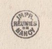
Imprimeries Réunies de Nancy Nancy, France
- IMPR RÉUNIES DE NANCY roundel
 PUBLISHERS, P.O. BOX 8, CINCINNATI (OHIO)
The company Imprimeries Réunies de Nancy was founded on 16 May 1905 by Albert BERGERET, after the merger of the Nancy establishments A. Bergeret et Cie, Helmlinger-Spillmann and A. Humblot, three big names towards the end of the inital phase of postcard mania. Humblot contributed his lithography, typography and collotype factory on rue de Metz, occupying a site of 1,880 square meters. Imprimeries Réunies spanned from 1905 to 1936 with a wide range of products including letterheads, share certificates, bonds, wine labels, liqueurs, cans, menus, advertisements, catalogue covers and posters.
As well as producing cards under the new imprint, Bergeret at least continued to produce some fantasie cards under the old imprint for a while. IRN cards are generally topographical.
Source: IMAGE’EST

Inland Printing Company,
Spokane, Washington, USA.
- Mfd by Inland Printing Co.
Inland Printing Company, corner of Howard and Main Streets, Spokane. Dutchman R. Kerkhoven settled in Spokane and bought an interest in the W. D. Knight Printing Company which in turn consolidated with the Wright-Greenberg Company into the Inland Printing Company. Kerkhoven was Treasurer of the company in 1907. Gordon C. Corbaley, returned to Spokane in 1897 having lived there as a child. He was then seventeen years of age, and engaged in newspaper work for four years, for a part of that time as a publisher and editor. In 1901 he became associated with the Company, already one of the leading printing houses in the west, as its secretary and manager and was still in post in 1907. The company moved to Walla Walla, 153 miles away but were still in in Spokane in 1912 when they published Washington association of drugless physicians inc by John E Lydon. My image of the Spokane County Court before it was fringed with trees was franked by the Spokane & Seattle Railway Post Office on 21 May 1907 and Paddington West on 6 June 1907.
Sources: Catalogue of Copyright Entries: Pamphlets, leaflets, contributions to newspapers or periodicals, etc.; lectures, sermons, addresses for oral delivery; dramatic compositions; maps; motion pictures, Volume 9, Issue 1; Washingtonians Containing Brief Histories of Men of the State of Washington Engaged in Professional and Political Life, in Manufacture, Commerce, Finance and Religion… A Reference Volume of Value to Libraries Newspapers, Magazines .and Colleges;1907
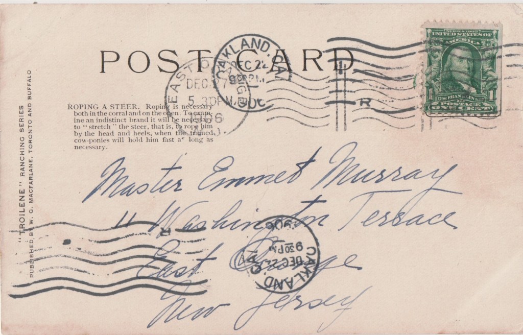
John Innes
- John Innes
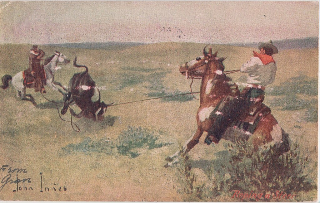
John Innes (1863 to 1941) was born in London, Ontario and had a long and distinguished career as an artist, author, illustrator, cartoonist, publisher, and correspondent. His artwork was published extensively throughout North America for many years, and during his employment in New York City for the Hearst publishing company.
Innes was an early and important artist in British Columbia history, arriving there in the early 1880s after surveying for the Canadian Pacific Railway which was then under construction. He served in the Boer War with the Second Canadian Mounted Rifles.
Innes exhibited with the Royal Canadian Academy and at the 1904 Louisiana Purchase Exhibition in St. Louis. As well as his fine-art painting career, Innes painted and worked as a commercial artist in Vancouver from 1913 until his death in 1941. He designed the posters for the 1919 Victory Loan campaign in British Columbia.
This card is an example of the frontier genre for which he was known, published by WG Macfarlane (qv).
Sources: Loch Gallery; Picture Postcard Artists Landscapes, Animals and Characters Tonie & Valmai Holt 1984 Longman page 80
International Art Publishing Company Limited
New York & Berlin
- INTERNATIONAL ART PUBL. CO. NEW YORK. Brown logo of globe with eagle landing on it, and sash with IAPCOLTD on it and handful of reeds.
- International Art Pub. Co. New York. Brown logo of globe with eagle landing on it, and sash with IAPCOLTD on it and handful of reeds.
International Art Publishing Company Limited, 3 and 5 Waverley Place, New York. Wolf and Company of Philadelphia and Samuel Garre, the manager of the Art Lithographic Publishing Company organised this company in a new building two doors from Broadway from 1 January 1896. The purpose was to take over the Christmas card and souvenir businesses of Wolf and the Art Lithographic Publishing Company, and to have a number of other lines. Garre managed the new company. The new company grew into an important publisher of artist-signed and sentimental cards. Their cards were printed in Germany and they are often said to be of Berlin as well as New York. Artist Ellen Clapsaddle (qv) was also involved in the business.
The business flourished as the robust German printing industry provided them with high-quality products. The postcards printed there were known for their well-executed colours, embossing, metallic foils, and other embellishments that attracted enthusiastic consumer correspondents. In 1909, when lower tariffs were proposed, the company argued for lower postcard tariffs. However, the protectionist case succeeded and the 1909 Payne-Aldrich Tariff brought in higher tariffs on foreign postcards and the end of the golden era of postcards in the US.
Sources: Metro Postcard web archive;The Publishers Weekly, Vol 48 from December 28, 1895
International Committee for the Issuance of Commemorative Postal Cards on the Occasion of the Holy Year 1900 Rome
- COMITE INTERNATIONAL pour l’emission des CARTES POSTALES COMMÉMORATIVES a l’occasion de L’ANNEE SAINTE 1900 ROME

Pope Leo XIII announced the Holy Year of 1900, which opened the new 20th century, with the Papal Bull Properante ad exitum saeculum. The Jubilees of 1850 and 1875 had not been celebrated, because of the turbulent political situation in Italy during those years so the announcement of the Holy Year in 1900 caused great rejoicing and put a series of initiatives in place aimed at reawakening Christian sensibility, not only in Italy but in the whole Catholic world.
One such initiative was the International Committee for the Issuance of Commemorative Postal Cards On The Occasion Of The Holy Year 1900.
Source: The Four Ordinary Jubilees of the 20th Century from Leo XIII to Paul VI Tiziano Scalzotto
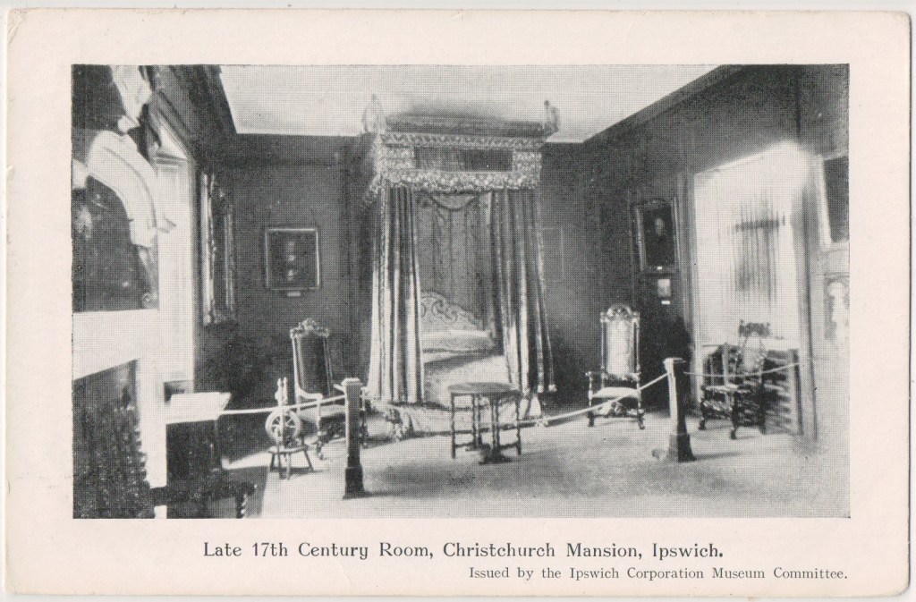
Ipswich Corporation Museum Committee, Ipswich, Suffolk, England
- Ipswich Corporation Museum Committee
Ipswich Museum opened in Museum Street in 1847: museum lectures were inaugurated in 1848 by Professor Henslow, mentor to Charles Darwin, and included talks by notable scientists. The museum ran out of funds in 1853, but the people of Ipswich voted to save the museum and it passed into the ownership of Ipswich Corporation, becoming one of the first museums to be supported by a borough rate. After this time it became free to all visitors four days a week, doubling the previous access.
Chairmen of the committee included Edward Packard, senior (5 January 1819 to 1899), an English chemist and businessperson who founded and developed a major artificial fertilizer industry near Ipswich in the mid-nineteenth century, Under his chairmanship, the museum committee advocated the recruitment of the geologist John Ellor Taylor as Curator in 1872. Taylor had founded the Norwich Science-Gossip Society and which became the example for a sister society in Ipswich, in which the sons of the town’s industry-owning families met regularly to improve their scientific knowledge and understanding of its industrial applications.
In 1873 the museum committee assumed responsibility for the nearby School of Art, and a School of Science was added in 1875. The Museum and the Schools of Art and Science were relocated to a purpose-built building in the High Street which opened in 1881.
At the opening and formal handing over of the new Museum to the Corporation on 27 July 1881 Curator Taylor said that the expansion of the Museum’s collection and library, the smallness of the old reading-room, and the fact that the Committee were only tenants of the old Museum building which was usually let in periods of eight years’ duration, and that the rent gradually increased, suggested the necessity for the town possessing a building of its own. The new building was built on a thirty-year mortgage for no cost to the Corporation more than they were already paying.
The Museum still occupies this building, with terracotta panels announcing Art and Science on either side of the main door, and sculptured reliefs of William Hogarth and Isaac Newton on the gables.
On Saturday 1 October 1881 an editorial in the Launceston Examiner in Cornwall citing the example of Ipswich earlier that year, commended the suggestion of his Worship the Mayor that the Municipal Council there should take over the Public Library, Museum, and School of Mines:
“The Mayor no doubt struck the right note when he said that the province of the Municipal Council was not confined to the mere gathering of the rates and expending them on the streets, the water supply, and the police: he held It to be the duty of the Council to take the lead in whatever was calculated to improve the town and elevate the community.”
Launceston Examiner Saturday 1 October 1881
A painting titled The Death of Eucles by Ipswich artist Frederick George Cotman (1850 to 1920) hung in the Town Hall for many years from 1871. The oil on canvas won Cotman a Gold Medal in 1873 and was shown at the Royal Academy in London. Eucles was an Athenian soldier who, covered with the blood of his enemy, leaves the army to carry the good news of victory to Athens. He reportedly said, “We triumph,” and fell dead at the feet of his wife and children. In 1956 the painting was sold by the Committee, possibly for as little as £1. It was thereafter owned by fashion designer Gianni Versace who was murdered in 1997. In 2009 it was expected to fetch £10,000 at auction.
Sources: Lisa Temple-Cox on flickr; Launceston Examiner
This Card: Christchurch Mansion is a substantial Tudor brick mansion house built around 1548–50 on the site of the Holy Trinity Priory which was founded in the 12th Century. The Grade I listed building is located within Christchurch Park and sits by the southern gates close to the town centre of Ipswich. The mansion belonged to various noble families throughout its history but was purchased by the Ipswich Borough Council in 1884. Since 1885, the building has been used as a museum The walls and floors bear the scars of over 450 years of changing designs. The rooms are set in period fashions from the Tudors through to the Victorian.
Source: Ipswich Museums

Iturbide Curio Store,
Mexico City
- J.C.S.
Iturbide Curio Store, 12 San Francisco, Mexico City, postcard editor in a shop under the Iturbide Palace, then a hotel. It was the business of Austrian photographer Jacob Kalb, who was the brother and uncle of emigrant postcard publishers in Mexico. He produced postcards in the early twentieth century.
JCS is an example of the typographic convention where “I” is replaced by “J”
Source: The Postal Card in Mexico
